Social Stamping | Sunflowers

What a glorious morning! We had such a lovely time stamping at the Taste of Dalyellup cafe. I shared one of the card options yesterday – A Cut Above male themed card. You can see it by clicking here.

The other card option was a sunflower creation using the Celebrate Sunflower stamp set and Sunflower Dies. This gorgeous bundle can be found in the 2020-2021 Annual Catalogue. As each new mini gets released in the catalogue cycle, I find it’s so easy to forget about sets in the annual.

The colours for this card are Night of Navy, Cinnamon Cider, Bumblebee, Crumb Cake and Whisper White.

I experimented with adding some texture by ripping the DSP or cardstock. I love techniques like this that don’t require any special equipment.

I always try to offer two versions of a card for Social Stamping, or crafts are welcome to create their own! This is the alternative version in a different orientation.

The DSP is the Flowers for Every Season – it’s a lovely mix of patterns and florals that coordinate with a couple of sets in the annual catalogue, but generally works well for lots themes with the pretty colour combinations of the 2020-2022 In Colors (Bumblebee, Cinnamon Cider, Misty Moonlight, Just Jade and Magenta Madness).

Thanks to the lovely ladies who come out and support Social Stamping. It’s such a pleasure to design cards for these sessions. And a huge thank you to the Taste of Dalyellup cafe. The ladies love their coffee and I love treating myself after class with their yummy sushi!

There’s no Social Stamping next Monday due to the Public Holiday, but we’ll see you the week after for more stamping!

Just Add Ink #541 | Blended Background

Hey there, thanks for joining me for another Just Add Ink challenge. I’ve said it before and I’ll say it again, it’s the variety in the Just Add Ink challenges that I love so much.

Today’s challenge is to add a Blended Background. I can’t wait to see how everyone does this – brushes, daubers, sponge rollers, ink pads…. this technique has lots of ways to reach your end point. I used the new Stamping Brushes by Stampin’ Up!. These makeup style brushes make seamless blending so easy. To help, I used Shimmery White cardstock with its ultra smooth surface and beautiful shimmer to help blend the colours.

Dragonfly Garden | kelly kent

Before applying the ink, I stamped the wildflowers from the Dragonfly Garden stamp set in Versamark and added Clear Embossing Powder. This is the Emboss Resist Technique and always a favourite when working with blended backgrounds. It means when you rub the ink over the cardstock, it doesn’t take up ink where the clear embossing is and that part remains whatever colour your background started (in this case white).

Dragonfly Garden | kelly kent

The colours I used for the ink blending are Daffodil Delight, Magenta Madness and Gorgeous Grape. I really wanted the colours to be bright and fun for this get well card.

Dragonfly Garden | kelly kent

I always like to balance the bright colours with black and white contrast. The dragonfly and the sentiment are white heat embossed on Basic Black cardstock. The get well soon sentiment is from the Blossoms in Bloom stamp set. It’s often my go to because I love the font and it’s got really sensible sayings that you want to put on the front of cards.

We’d love to see your blended background projects. Please share your creation in the gallery on the Just Add Ink blog to join in the challenge. You can also see the other design team cards for colour & design ideas with ink blending.

Have a great weekend!

kelly kent | mypapercraftjourney.com

Trimming the Town | Step Panel Card

This style of card (Step Panel Card) has been on my to-make list for forever. It’s definitely in the category of super easy once you know how and looks amazing, so I’m not sure why it took me so long to try it out!

Step Panel Card | kelly kent

The card has two hinged sections which sit into box shapes when the card is standing up and lay flat when folded. This means it can be displayed beautifully, but it can also fit into a standard size envelope.

Step Panel Card | kelly kent

I followed instructions and measurements by Amanda Bates – you can see her post here.

Step Panel Card | kelly kent

The theme for this card started with wanting to have the cute little Christmas trees from the Home Together Dies on the front panel. I used the ink swiping technique to create the coloured cardstock for these. Using the edge of your inkpad, swipe the whole pad (at an angle) across a piece of Whisper White cardstock. I layered Soft Sea Foam and Pear Pizzazz to get some contrast in green. I used the same technique for the cardstock on the front of the card base.

Step Panel Card | kelly kent

The Trimming the Town DSP coordinated beautifully with my trees so I’ve used it on the back panel of the card. The front panel is Whisper White with embossing from the Wrapped in Texture Embossing Folder.

Step Panel Card | kelly kent

The finishing touches were Gold Glitter Enamel Dots and a Christmas sentiment from the Peace & Joy stamp set.

You can see the card above all folded up and ready to go in the envelope. It’s the perfect level of fancy, fun and practical for Christmas cards you need to post this festive season.

If you need any more supplies for you stamping stash, my online store is open 24-7 and delivery starts at a very low $5.95 direct to your door. Click here to start adding to your shopping cart.

Happy shopping and stamping!

kelly kent | mypapercraftjourney.com

Paper Adventures Team Hop | Pointillism

Paper Adventures - Blog Hop Header

Hello! Thank you for joining us for another Paper Adventures Team Hop. I’m mildly spinning that it’s mid October already. This year has been such a mixed bag that it’s equally the longest year ever combined with the most rapid year ever! That level of contradiction suits 2020 perfectly!

We welcome Kayla McCreadie today as our guest designer and I can’t wait for you to see what she has created. She has a beautiful straight line design style with lots of layers and texture. You can visit Kayla’s blog by clicking on the next button at the end of this post.

The theme for today’s team hop – pointillism – was chosen by Narelle and is just wonderful for extending our creativity. Pointilism is creating an image or pattern using small dots. Because of this, it can sometimes be called ‘dot colouring’ or ‘dot painting’.

You may not have heard of pointillism before if you’re a Stampin’ Up! lover, you will have definitely seen it! There are several Stampin’ Up! stamp sets that use this style to create the artwork including the Whale Done stamp set from the current Annual Catalogue. The images are made using lots of tiny little dots!

Using the fabulous samples from the Annual Catalogue to inspired the design, I’ve recreated each card on page 96 using Stampin’ Blends and the no line stamping technique. This gave the style more detail and colour than if stamped in one ink.

Whale Done - pointillism | kelly kent

Have you tried no line stamping before? Ink up in a light neutral ink (I’ve used Smoky Slate but Sahara Sand also works well) and stamp on scrap paper to remove most of the ink before stamping on Whisper White. You should be able to faintly see the image – enough so to add colour.

Whale Done - pointillism | kelly kent

I followed the basic shading of the stamp in the light and dark version of the Blend colours. I must admit, wasn’t too careful or fussy about where the dots went or how far they are apart. If there was too much white space, I added in more dots.

Whale Done - pointillism | kelly kent

The bullet tip end of the Stampin’ Blend provides the perfect size and intensity of dot for this project.

Whale Done - pointillism | kelly kent

This is one of my all-time favourite DSP packs. If you don’t have some, you should buy some! And if you have some, you should stock up on some more while it’s 15% off. Just $17 until the end of October. Click here to view all the DSP patterns that are part of the DSP sale in my online store.

Whale Done - pointillism | kelly kent

As well as colouring the image, I also used blue tones for shading around the outside of the sea creatures. There’s differents ways of expressing the pointillism theme. You could also use a solid image and add the dots around the outside.

To see how the rest of our team and our guest designer, Kayla McCreadie have been inspired by the pointillism theme, keep hopping along. For a full list of participants see the bottom of this post.

Next up is Kayla’s blog.

Thanks for joining us. We hope this theme has inspired some creativity for you this weekend.

kelly kent | mypapercraftjourney.com

PARTICIPANT LIST
Kelly Kent
Kayla McCreadie (Guest Designer)
Lisa Whitehead
Robyn Houston
Shannon Kissane
Mandy Depiazzi
Narelle Simm

Happiest Birthday Wishes | multicoloured greetings

I’ve been loving the Happiest Birthday Wishes stamp set. It’s filled with super versatile birthday greetings, and since birthday cards are the most common card I make, it’s had a good workout since it was released in the 2020 Annual Catalogue in June.

Today I’m sharing a technique that adds some fun to the large stamp from this set. Big stamps can sometimes be hard to use but are perfect when you want the sentiment to be the feature of the card.

Colours: Rococo Rose, Bumblebee, Calypso Coral | DSP: Artistry Blooms

Using the Stamparatus, I added ink to the top & bottom of the stamp directly with the ink pads and then to middle with a sponge dauber.

You don’t need a Stamparatus to use do this technique but I love two things about using it – 1. You can re stamp if you need a bit more ink somewhere or better blending 2. You can easily make lots of these with minimal fuss. I pre-cut the scalloped rectangles (from the Stitched So Sweetly Dies) and kept one of the negatives. I was then able to place the die cut into the Stamparatus for quick & easy placement. This is a great tip for cards you want to mass produce.

After making the first card in pinks, I decided to make another version with one of my favourite DSPs from the Annual Catalogue – Whale of a Time. I’d be happy to have a whole pack of the turtle prints – they are so pretty!!

Colours: Pacific Point, Rich Razzleberry, Granny Apple Green |
DSP: Whale of a Time

And one more using another favourite – Boho Indigo. I used an ombré effect for this sentiment, choosing 3 different shades of blue.

Colours: Balmy Blue, Pacific Point, Night of Navy | DSP: Boho Indigo

I could make these cards all day! It’s a great way to make use of the DSP we like to collect. Simply cut a 2” strip and adhere to a coordinating card base. Stamp your multicoloured sentiment and attach to the card front.

Have a great week!

Social Stamping | friend

Image may contain: text

Hello friends!  It’s so nice to have you hop around Social Stamping Blog Host #4.  Today’s theme is ‘friend’.  I’m missing seeing my friends, being able to hug my friends, being able to catch up for coffees, or linger for a chat at school drop off.  This weekend was supposed to be a camping trip with friends, which we’ve had to postpone.

As much as I miss my friends, I’m also very grateful to have been on the receiving end of some lovely gestures of friendship that make social distancing and isolation a little easier.  I’ve had Zoom chats with friends so I could still see them, I’ve had surprise deliveries on my doorstep, I’ve had happy mail cards arrive in the letterbox.  I love the irony that the very same virus that is keeping us apart is actually bringing us all together.

Knowing how lovely it has been to receive surprises during this time, I’m planning a few surprises of my own!  And happy mail is always more fun with a pretty card to open too.

The set of cards I’m sharing today was inspired by some of the gorgeous art I’ve seen shared on the Rainbow Trail page (read more about the Rainbow Trail in last week’s social stamping post).

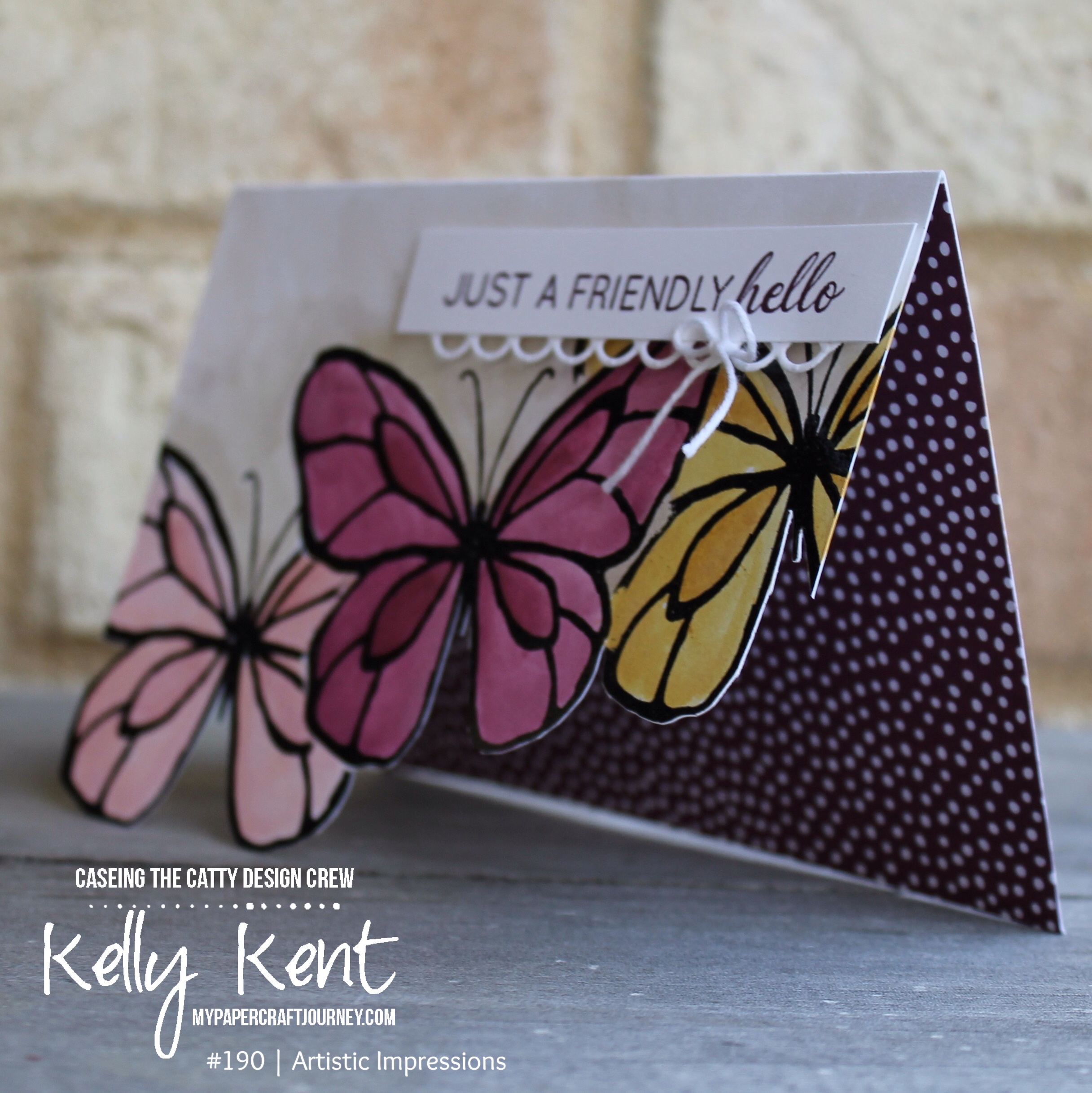
Using washi tape to mask the lines and Stampin’ Blends to colour the spaces, I made these card fronts…

Washi Masking Technique | kelly kent

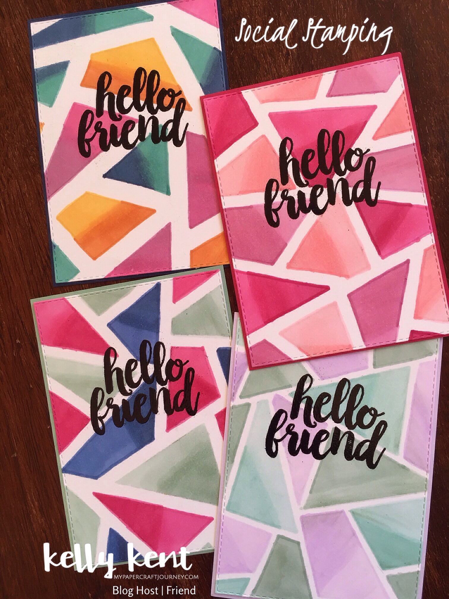
They started as a piece of Whisper White cardstock with washi placed across the front to separate the card into segments.

Washi Masking Technique | kelly kent

I then coloured each segment with 2 different Stampin’ Blends.  My first attempt used solid colours, but the blended effect looked much better!  And works perfectly with the Stampin’ Blends.  I also tried a variety of different colours & thicknesses of washi tape.

Once coloured, I ever-so-gently lifted the washi tape up and then cut the artwork with a stitched rectangle.  The ‘hello friend’ stamp (from Seriously the Best stamp set) was heat embossed in black.  This was adhered to a coordinating piece of cardstock and attached with Stampin’ Dimensionals to a Whisper White card base.

Here’s the finished cards –

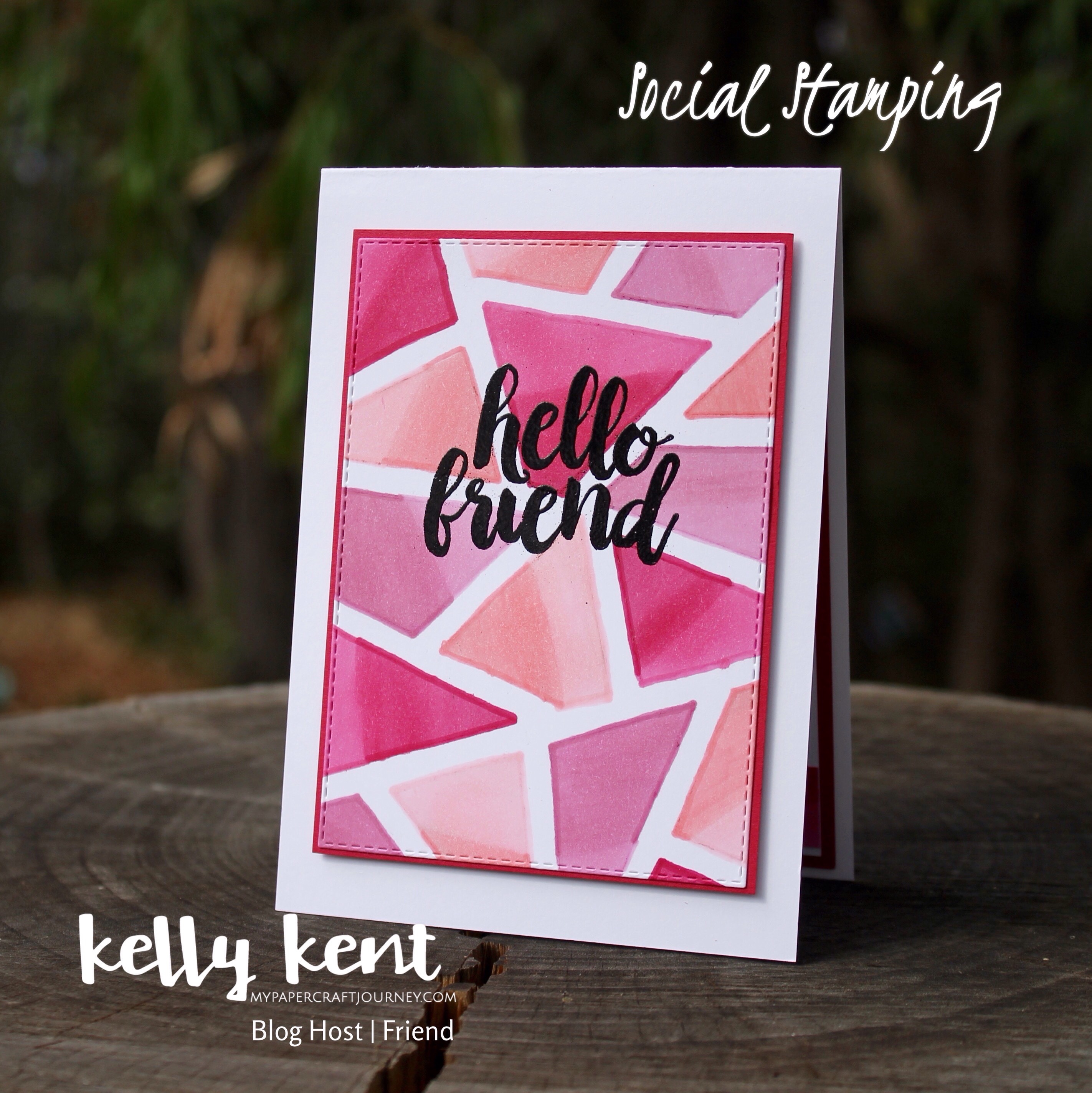
Thick washi with two tone segments in a multi-colour scheme
Blends: Dark Pumpkin Pie, Dark Mango Melody, Light Night of Navy, Dark Bermuda Bay, Light Lovely Lipstick, Dark Rococo Rose.

Washi Masking Technique | kelly kent

Medium washi with ombre segments in one colour scheme
Blends: Light & Dark Flirty Flamingo, Light & Dark Rococo Rose, Light & Dark Lovely Lipstick

Washi Masking Technique | kelly kent

Medium washi with ombre segments in a multi-colour scheme (bright)
Blends: Light & Dark Lovely Lipstick, Light & Dark Night of Navy, Light & Dark Mint Macaron

Washi Masking Technique | kelly kent

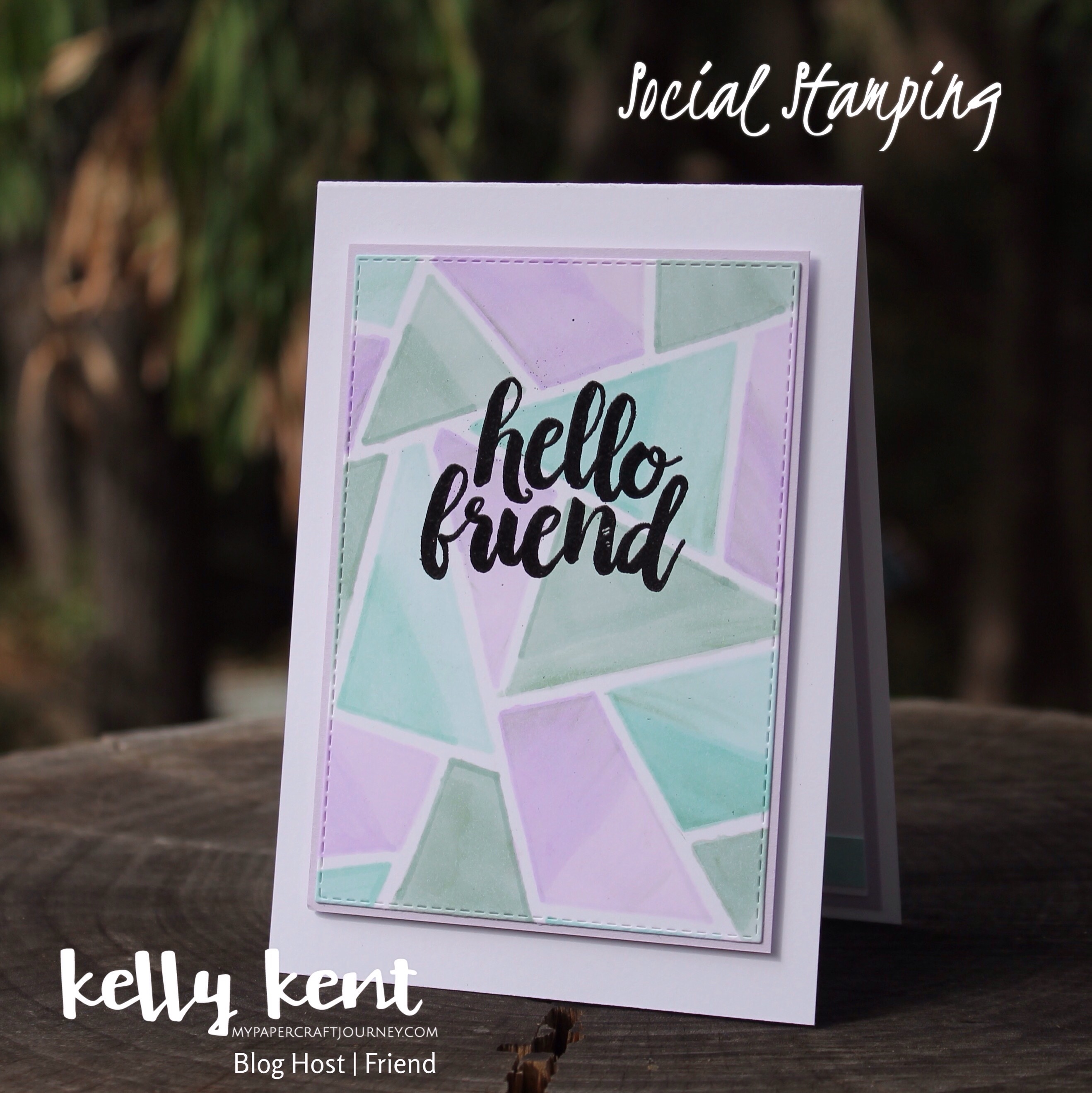
Thin washi with ombre segments in a multi-colour scheme (pastel)
Blends: Light & Dark Purple Posy, Light & Dark Pool Party, Light & Dark Mint Macaron

Washi Masking Technique | kelly kent

This technique is so easy and looks amazing!  I love that the finished effect looks different for each set of colours.  It’s also a perfect way to get some use out of retired washi tape that seems to build up for me, no matter how good my intentions are to use it!


The next friend on my list is Nicole Wilson and her fun project.

No photo description available.

I’ve been humbled each week to hop with so many amazingly talented stamping friends.  It’s also been a delight to welcome new designers to the blog host each week.  Thank you to you all for making this happen.  To see the full list of participating blogs, visit the main blog host post (that’s a tongue twister!).

Enjoy the rest of your weekend.  I hope it involves some time to make something special for a friend.

Just Add Ink #446 | Photo Inspiration

I can’t wait to see what entries we get this week for Just Add Ink – the photo inspiration is just gorgeous!!!

Image may contain: flower

The colours and textures of this vibrant photo are sure to get the sparks of creativity flying!

The tiles on the wall reminded me of the Tin Tile Embossing Folder that carried over from the Holiday Catalogue.  If you’re ever curious which items from the Holiday Catalogue avoided the retirement list, you can see them all here in my online store.

I designed this card with my February classes in mind.  Each class I try to do one deluxe card – and after some Pinterest research, I came across this gorgeous fold by Barb Stamps (Barb Mullikin) called a Pull Out Side Pocket Card.  You can see Barb’s blog post & video by clicking here.

Pull Out Side Pocket Card | kelly kent

The card is standard size with a right entry pocket flap for a writing panel.  You could also use the flap for tucking away other things like a gift card or voucher!

Barb is in the US so I slightly adjusted the cardstock sizes to match the C6 size cards we use in Australia.  Card base is 7-3/8″ x 6-7/8″, scored at 4-1/8″ on the long side and 1/2″ from each edge on the short side.

The mat on the front of the card and the cardstock for the pocket insert are both 3″ x 5-5/8″.

Pull Out Side Pocket Card | kelly kent

Although I love the white wash tiles in the photo, I wanted to try adding Versamark to the embossing folder before I made the imprint on my cardstock and then coating with copper embossing powder for an oxidised copper effect with the teal (Bermuda Bay) peeking through.

Pull Out Side Pocket Card | kelly kent

The flowers in the vase are from a new stamp set in the Occasions catalogue. They fit the existing Vases Builder Punch – which is a bonus if you already have this!

I’ve stamped the flowers in Lovely Lipstick on Shimmery White and then used an Aqua Painter to add more Lovely Lipstick & Mango Melody ink – just like in the inspiration photo.  The vases are heat embossed in copper and coloured with Bermuda Bay ink.

Pull Out Side Pocket Card | kelly kent

I can see this style of card being a favourite for when I need something a bit fancier!!!


You can see all the design team creations for this challenge on the Just Add Ink blog.  You can also add your project to the challenge link up and share how the photo inspired you!

Thanks for visiting!


Product List

Just Add Ink #445 | Embossing

Hello!  You’re going to love the Just Add Ink challenge this week – we’re adding embossing!

Image may contain: text

Make a project with any kind of embossing you like – heat, paste, folders….  There’s so much potential!  Go nuts and add all the embossing if you like!

I decided this challenge was the time to dust off my neglected embossing mat and use them with the Butterfly Beauty Thinlits to create a pretty background effect.

Just Add Embossing JAI#445 | kelly kent

If you haven’t used an embossing mat before, it’s an extra set of layering plates & mats for your Big Shot that transform cutting dies into embossing dies.  They don’t cut through – they just leave the imprint on your cardstock.  Magic!  Especially when you add a spritz of Shimmer Paint (which of course you can’t see in the photo – but it’s there and it looks fab!).

Just Add Embossing JAI#445 | kelly kent

I’ve layered butterflies from the same Thinlits set on top and cropped down one of the bigger sentiments to just include ‘friend’.  Of course, the sentiment is heat embossing in white – that’s my favourite use of embossing!

Just Add Embossing JAI#445 | kelly kent

The DSP is from the Floral Romance suite.  This sheet is a vellum finish and just gorgeous!  The colours and pattern are so beautiful.  I love Rich Razzleberry and Old Olive together.


Thanks for stopping by today.  To see all the design team projects and add your card to our embossing themed challenge, visit the Just Add Ink blog.


Product List

CASEing the Catty #190 | Artistic Impressions

Hello Sunday visitors – the end of the weekend rolls around so fast, doesn’t it??

CASEing the Catty blog hops are always a great way to finish the weekend.  Hopefully you found some craft time in yours – and maybe joined CTC#189 by sharing your project in our Facebook group..

There’s still 24 hours to participate in last week’s challenge (CTC#189), or you can start the week by creating for challenge #190 – pages 127-141 of the catalogue, featuring some of the samples from the Artistic Impressions section of the 2018-2019 Stampin’ Up! Annual Catalogue.

No automatic alt text available.

As always, the pages are filled with wonderful inspiration.  This Beautful Day sample on page 134 caught my eye…

I love the layered look of the front of the card.  I swapped the flower for the butterfly and changed up the colours to create this card…

Beautiful Day | kelly kent

The butterfly part of the card was created by stamping & black heat embossing the middle butterfly first.  I also created a mask using copy paper which I placed over the first butterfly before stamping & black heat embossing the two butterflies either side.  I love the strong & shiny look of the black embossing powder.  It’s so lovely to have it back in the catalogue!

I coloured the butterflies using an Aqua Painter in Blushing Bride, Rich Razzleberry and So Saffron, and added a shadow above the butterflies in Crumb Cake.  The butterflies also got a splash of Wink of Stella at the end!

Using snips, I cut the bottom edge from the butterflies and added DSP to the inside of the card.

Beautiful Day | kelly kent

As this was a card for a brand new team member who signed during the July recruiting special, I changed the sentiment to ‘hello’.

Beautiful Day | kelly kent

This is a set you’ll want to own – it’s called Another Wonderful Year and is filled with pretty fonts & great sayings!

August is a great time to work your way through some of your Annual Catalogue wishlist – you’ll collect Bonus Days vouchers for every $90 you spend.  See all the details here.

Don’t forget that we’d love for you to join us for this challenge.  All the action happens in our Facebook group.   Click here to join.

You’ll also want to continue the hop to see what the other design team members have created using the Artistic Impressions pages as inspiration.

Next blog to visit is the gorgeous Judy May.

Thanks for joining us!


Product List

Delightfully Detailed

Every month I run a class for Stampin’ Up! Demonstrators in my team (but all demonstrators in the area are welcome).  I aim to include products & techniques in each class that expands their wishlist!!!

Sometimes it’s hard to know how much you’re gong to love a product til it’s on the table and you’re crafting with it!

In May, we made these sweet cards using the Delicately Detailed Laser Cut DSP.  There’s multiple sheets in each pack of 2 different designs – one page of smaller (card front size) designs and a sheet of 12″x12″ floral pattern.

As I was cutting up this paper for the class preparation, I did wonder if the Delightfully should be replaced with “Delicately”… it’s a bit of a handful to keep the precious paper in tact as you cut it up, but the end result is worth the precarious handling!

We used the floral design cut into 4″x6” pieces to make these two cards…

Delightfully Detailed DSP | kelly kent

The card on the left is the DSP coloured with Balmy Blue, Blueberry Bushel & Night of Navy.  The card on the right is the negative of the colouring – the DSP acts as a mask.  Such a pretty, fun & easy technique.

Delightfully Detailed DSP | kelly kent

The thank you sentiment & die panel is made using the Stitched All Around stamp set & Stitched Labels

I didn’t think I’d love Blueberry Bushel as much as I do – it’s such a gorgeous tone!

Delightfully Detailed DSP | kelly kent

The colouring across the DSP was achieved using the sponge brayer.  We used three different sponges, but if you’re doing this at home, you can use one brayer – start from the lightest colour (Balmy Blue for this card), then the medium tone (Blueberry Bushel) and then the darkest tone.  Sweep from side to side to apply the colour evenly, make sure to ink all the way around your brayer and overlap the colours so they blend.  Everyone likes a different method of colouring but I find the brayers are much easier for me to achieve an even colour than sponge daubers.

I do love an ombre card, but this would be a great design in a range of colours!!!  What would your choice of 3 colours be?

kelly kent | mypapercraftjourney.com


Product List