Sweet Symmetry | Paper Adventures Team Day

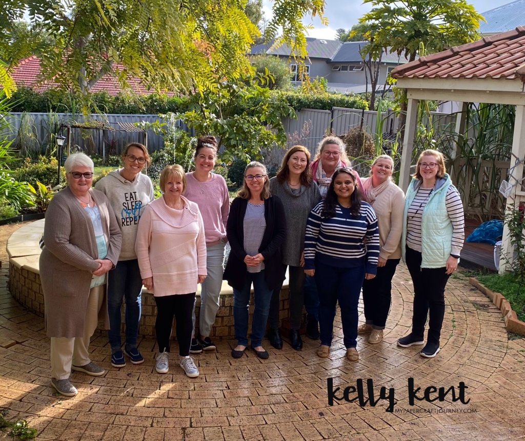
Every year our Paper Adventures team meets for a retreat day in Perth. This year we were hosted by Shannon Kissane and while the weather was wet and grey outside, we had the pleasure of spending the day stamping inside. The weather even broke for a short while which allowed use to enjoy lunch outside.

As usual, I forgot to take any photos except this amazing group shot. What a fabulous group of crafters!

We used the same format for this team day as previous ones we enjoyed and crafted using “shoebox swaps”. Each crafter designed a project, made up the kits and put it in a box with all the supplies required to make it up. We rotated around the table until we’d made 8 of the kits, allowing approximately 20 mins per project. The projects we didn’t get to make in person, we took home as a completed sample.

Here’s the cards I designed for my shoebox…

I had kits available in each colour option so stampers could choose the one they preferred. It was a 50-50 split on favourites with one of each colour left over at the end.

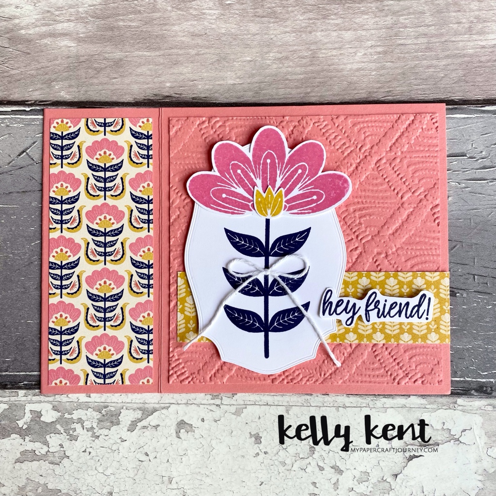
The card style is one I’ve shared a lot this week – a notebook fancy fold. The stamp set is In Symmetry – one of my new catalogue favourites together with Sweet Symmetry DSP. I think the colours and styling of the DSP made me fall in love with the stamp set. Pink & yellow has always been a favourite of mine.

There was a little bit of fussy cutting involved but everyone snipped with good grace. This stamp set would be perfect with coordinating dies (hint hint Stampin’ Up!).

I design & make so many cards for classes, it’s always an absolute pleasure to make a card designed by someone else. Across 10 cards, we had such a unique mix of styles, colours and products. It’s a well known fact that you should always wait until after a team gathering to put in your next Stampin’ Up! order. There’s always A LOT of enabling!!!

Here’s what the rest of the team made for their shoebox projects –

Check out the blogs of my talented teamies –

Lisa Whitehead
Mandy Depiazzi
Robyn Houston
Sheila Pybus
Shannon Kissane
Narelle Simm
Sana Arslan

We missed a couple of our team who couldn’t be there on the day due to illness and other commitments. We look forward to another one later in the year because you can never get enough of stamping with good people!

Paper Adventures Team Hop | out with the old

Hello! It’s my pleasure to be hopping with my Paper Adventures team today. As we farewell the Jan-June Mini catalogue at the end of this month, we’re taking the opportunity to share favourites that we’re going to miss in this ‘Out With the Old’ theme.

My absolute favourite from the Jan-June mini was the Pretty Perennial bundle. Designed by Dena Rekow in honour of her million dollar sales achievement – I love everything about it!

For today’s projects, I have CASEd the cards from the catalogue using this bundle and added in the Hey Girlfriend stamp set for some fun teen cards.

I didn’t buy this stamp set when the catalogue first came out but I always planned to add it to my collection before it retired. It’s a great one for the long term stash – especially having two girls who are fast growing up!

There’s three different girls in the stamp set – all with a different style, which I love! I think this little lady is my favourite – possibly it’s the glasses, Ra-Ra skirt and the cute hair that have me hooked!

Using Stampin’ Blends, you can colour the girls to theme with any card design and using any skin tone you like. I really love this chart by Jacque Williams which allows you to see each of the combinations and had an option to download the chart and create your own skin colour table. Click here to visit Jacque’s blog.

I didn’t have the exact same products in each of the samples, so I substituted where I needed to which is the perfect way to CASE. One of the definitions of CASE stands for Copy and Selectively Edit.

Next up on today’s hop is the lovely Narelle Simm

Thanks for hopping with us tonight. Have a lovely weekend!

kelly kent | mypapercraftjourney.com

Paper Adventures Team Hop | In with the new

Hello! We all made it to the end of the week! How was yours? I’ve had a really lovely week filled with work, stamping, and family – all of which brought me great happiness.

I’ve also had the pleasure of sharing quite a few projects with you this week as part of my design team commitments and tonight’s a fabulous hop with my Paper Adventures Team. The theme is ‘In with the new’ and I can’t wait for the team to show you all the ‘new’ crafting they’ve been doing.

We welcome my gorgeous friend Narelle Farrugia, Artisan Design Team alumni, as our guest designer. Thanks for joining us Narelle – so great to have you share your talents on our blog hop.

My project from today uses my very favourite suite from the new 2021-2022 Annual Catalogue – Expressions in Ink. I love every part of this – the stamp set (great sentiments), the die set (amazing centrepiece die), the DSP (oh my – watercolour!) and the ephemera pack (bling!).

I used all the elements of the suite to make this sweet card for a new team member who joined our Paper Adventures team during the Join+ promotion. Christine purchased her Starter Kit for $169 and received $283 of her favourite Stampin’ Up! products with free shipping and a discount on all her future purchases until at least the end of October 2021. If you’d like to take advantage of this great offer, click here to join.

The big floral die in the Artistic Dies adds a wonderful wow factor to all your projects. You can use it plain, cut the pieces apart or add stamped flowers behind the die cut like I have in this card.

The dies in the set also cut the stamped flowers and leaves from the coordinating Artistically Inked stamp set. This set has a watercolour effect. Christina Wrede shared a great tip on Instagram during the week to apply ink to your watercolour style stamps with a blending brush. I found that a combination of techniques worked for me – inking directly from the ink pad and then smoothing the ink out with a blending brush was perfect.

The DSP has gold foiling on one side of each of the patterns – it’s so wonderfully deluxe! The ephemera pack has gold die cut accents and adhesive backed sequins that add the perfect finishing touch to all your projects. Stampin’ Up! have kindly provided a suite code – 155459 – for this great product range – making it easy to order it all at once (because you know you *need* it!).

To shop your favourite Stampin’ Up! products – head over to my online store. Stampin’ Up! offers amazingly low shipping of $5.95 for all orders under $120 and just 5% for overs over $120. Have it delivered to your door and be crafting with new products in no time at all.

Next stop on the team blogging adventure is Narelle Farrugia – I know you’ll love what she’s made, I always do!

Thanks for joining us, I hope you have a great weekend! I have more projects to share with you across the weekend, so I’ll see you then! To get every new post straight to your email address, fill in the subscription form below

Enter your email address to subscribe to this blog and receive notifications of new posts by email.

kelly kent | mypapercraftjourney.com

Paper Adventures Team Hop | photo inspiration

Hello! Welcome to the April hop for our Paper Adventures Team. The theme tonight is a fabulous photo inspiration.

The photo was taken by our resident team photographer Siobhan Fitzsimmons at her Hightrees property. She is surrounded by the most wonderful Australian native flora & fauna.

I didn’t feel I could do justice to these native mushrooms, so I’ve used the theme to create using the cutest craft mushrooms we have in the Stampin’ Up! Collection – the Snail Mail DSP!

Snail Mail is a whole pack of fun – mushrooms and snails as far as the eye can see. I’ve layered them on this super fun double slider card. Yep – two sliding snails!!!

I first made a card like this last Christmas at a class by Mandy Depiazzi. She saw the idea on Lisa Curcio’s blog and made this version (click here to see). I couldn’t decide which snail to make slide, so I added two tracks and attached a snail to each.

When you pull the tab on the right side of the card, the inner piece slides out and guess what? – another snail & mushroom combo!

It’s a little bit of fussy cutting for the pieces. The coordinating dies cut out some of the snails, but they can all be cut using your Stampin’ Snips.

The beautiful fonts of the birthday sentiment was the final touch for this card. You’ll find that cute happy birthday in the retiring Rustic Retreat stamp set. At the time of writing this, it was still available at an amazing 75% discount – jump online to see if it’s still available now.

You’ll also want to keep hopping and see what the rest of the Paper Adventurers have been inspired to create by Siobhan’s photo. The full participant list is below, but if click on the next button you’ll travel around all the blogs. From here it’s over to the wonderful Narelle Simm

Have a wonderful weekend!

Participant LIst
1. Kelly Kent
2. Narelle Simm
3. Lisa Whitehead
4. Siobhan Fitzsimmons
5. Shannon Kissane
6. Sana Arslan

Blossoms in Bloom | CASEing myself

How quickly are these months rolling around??? The first week of March is almost done which means it’s time to get ready for some more birthdays. This year for my team birthday cards, the them is yellow. This was the first design (see the original blog post here) –

Pretty Perennials | kelly kent

I’m still in love with the yellow, black and white combination, so I decided that rather than start with a new design, I would CASE (copy and selectively edit) the previous version. Using Daffodil Delight, True Love DSP and the Blossoms in Bloom bundle, this is the next version of the team birthday cards…

Blossoms in Bloom | kelly kent

The card base for this card is Basic Black with the card front being layered with True Love DSP, a scallop edge border from the Ornate Borders Dies and Basic White cardstock. The Many Layered Blossom Dies are the focal point of the card. The bottom layer is cut in Daffodil Delight and the top layer in Basic White. I used Adhesive Sheet on the white cardstock before cutting to help stick the layers together. I hate messing around with wet glue – it seeps everywhere. I love the clean finish of using Adhesive Sheets.

Blossoms in Bloom | kelly kent

The sentiment is from the Blossoms in Bloom stamp set – one of my absolute favourites for everyday sentiments.


When I make cards in a layout like this, I will almost always make a second in a different variation – change the colour, change the orientation. It’s a formula that works for me to create a bank of cards for my stash (and if you follow my blog or socials, you will have seen me do this often). The alternative to this card was a Rococo Rose “hello” version.

Blossoms in Bloom | kelly kent

I’m going to miss this colour when it retires at the beginning of May, so I’m trying to use it as often as I can!

Blossoms in Bloom | kelly kent

The black & white with a pop of colour is a design combination that works with every colour, so you can sub in your favourite colour and create your down version of this card.

Blossoms in Bloom | kelly kent

Happy birthday to all our March Paper Adventures team members. I hope you all have a wonderful birthday month – filled with lots of happy!!!

kelly kent | mypapercraftjourney.com

Pretty Perennials

Is a stamping Mumma allowed to have favourites??? Luckily for the products in my collection, my favourites are constantly changing but at the moment I am totally in love the with Pretty Perennials stamp set and Perennial Petals Dies.

So far I’ve shared a super cute ice cream punch art creation using these dies – you can see that here, and a happy mail swap card – you can see that here.

The cards I am sharing today were made for my team and customers. I love being able to send a card as a thank you with an order and I always send out birthday cards for my team.

The theme this year for my team birthday cards is yellow – and they’ll find out why when they get their birthday card in the mail. Not everyone loves birthdays, but I have always enjoyed celebrating another year for my family & friends.

Pretty Perennials | kelly kent

This card is a little fussier than my usual style, but the flowers (stamps & dies) in this set layer so beautifully!

Pretty Perennials | kelly kent

I’ve used three different yellows – So Saffron, Daffodil Delight & Bumblebee. I love that our ink & cardstock coordinates so you can confidently use them together and they have the same tone.


After making the yellow version, I decided to change up my usual colour choices and add in a purple version. Purple is not a tone I usually craft with – which is funny because it matches so well with so many other colours! You’ll often find one of the purple tones in DSP!!!

As I so often do, I changed a few things in the original design to create a same same but different card. Different layout direction, different colours, different DSP pattern, different sentiment option. For very little brain power you get a wonderfully coordinating, but unique card.

The colours in the purple version are Gorgeous Grape, Highland Heather and Purple Posy. Due to issues with manufacturing that couldn’t be resolved, we haven’t had Purple Posy ink for most of the time the colour has been available. Luckily, Highland Heather when stamped off comes pretty close and is a great substitute!

The black & white DSP on both cards is True Love DSP from the Jan-June 2021 Mini Catalogue. I’ve seen lots of B&W lovers say there should be a B&W option in every catalogue and you know what – I think I have to agree. It provides such a good base for cardmaking, especially when mixed in with monochromatic cards.

Pretty Perennials | kelly kent

While we are celebrating all things happy, happy back to school day for all the students in Perth & the South West that returned to school today. Thankfully a week of lockdown meant we were able to return to life as usual in the south west and expecting the same for Perth again very soon.

Have a fabulous week!

kelly kent | mypapercraftjourney.com

Lockdown | what cardmaking?

Parts of my state of Australia went into lockdown a week ago in response to a virus outbreak. It would seem like lockdown would be the perfect opportunity to get lots of cardmaking done – but the reality of my week was a little different. With the Mini Papercrafts home for the 9th week of school holidays, day care closed for the week and my working days switched to working from home, there always seemed to be something other than the craft table that demanded my attention. On the plus side, we enjoyed family walks, had time for some baking and I got to experience working from home for my job as a paediatric Speech Pathologist.

Knowing that my team were all in lockdown in their respective locations, we were lucky enough for lots of us to be free for a Zoom team meeting on Thursday night. We chatted lockdown (of course), caught up on how everyone was going, talked Stampin’ Up! and then crafted while chatting some more. The brief was to create something you could send to a teamie.

I had the Pretty Perennials bundle on my craft table from my ice cream girl creation last week (you can see that here) and a Pretty Perennials stamping session earlier in the week before lockdown hit – I’ll share those projects with you tomorrow.

So, I knew I wanted to use the Pretty Perennials bundle again (I think it’s my mini catalogue favourite at the moment – or at least one of several favourites). Being on a meeting length time frame to make something, I opened the catalogue for layout inspiration and chose the DSP & banner combination on page 8 of the mini catalogue.

Pretty Perennials | kelly kent

For the DSP background, I used the Flower & Field DSP which you can add to your order for {FREE} during February once the total before shipping reaches $90. The blue and yellow of the DSP led me to the colour choices for the banner and other DSP strip.

Pretty Perennials | kelly kent

For the flowers, I wanted to add some more colour, so I used Blushing Bride for the large flower and then coordinated in the yellow (Bumblebee) and blue (Pool Party) for the other flowers.

Pretty Perennials | kelly kent

The flowers in this set are gorgeous, but it’s the ‘happy’ that keeps drawing me back. Unfortunately there’s no die for it, so it’s fussy cutting therapy for that one, but it looks so cute on the card that I’m happy to take the time to cut it out. The ‘sending’ and ‘mail’ – in a font that I just adore – are white heat embossed on Just Jade cardstock.

There’s everything to love about this stamp set and coordinating dies. I think I’ll keep it on my desk for a little longer before moving on to something else!

kelly kent | mypapercraftjourney.com

Paper Adventures Team Hop | new in 2021

Happy new year (again!). I’m excited to be kicking off another year of blogging with my amazing Paper Adventures Team. We always invite a fabulous guest designer to join us and this month we are blessed to have Linda Dalke. Thanks for joining us!

The theme for this month is “new” – a theme that works well in January, not only for the promise of a new year and all it holds, but also the launch of a new catalogue! We’re also sporting an update of graphics – thanks to Narelle for providing the new & fresh look for our team hops.

I have chosen to create with one of my new purchases – the Well Suited Suite (that’s a lot of English pronunciation to get board with!). This is the male focused suite from the Jan-June 2021 Mini Catalogue, described as ‘classic gentleman’ colours.

I’m not sure I married a classic gentleman. At Papercraft HQ suits are for weddings and Mr Papercraft spends his days off work in comfy t-shirts, not button down shirts. So, I decided to have some fun with this suite and what else it could do.

The first card I made uses the Well Suited DSP to create a smart but fun shirt. I do most of Mr Papercraft’s clothes shopping and would love to buy him a shirt like this!

Well Suited | kelly kent

How cute is the manly floral! It could also work for a ladies card – which makes this DSP very versatile! The range of patterns and colours for guys shirts has increased over the last 10 years. There’s more than just black, white and gray for the stylish dresser!

Well Suited | kelly kent

The Suit & Tie Dies have an array of builder pieces to make so many combinations of shirt designs including lapels, pocket, buttons, bow tie, tie and more!

The sentiment is from the Handsomely Suited stamp set. There’s also coordinating pieces for the die set, but I really love the solid & sensible sentiments it provides.


The second card I made was also inspired by Mr Papercraft. His work uniform is hi-vis. With a large mining workforce here in Western Australia, these fluro shirts are very much part of the working landscape. Do you have hi-vis in your country?

Well Suited | kelly kent

The Silver Foil really adds the perfect touch of reflective reality to this shirt! It looks too clean though! Perhaps I need to add some dirty patches.

Well Suited | kelly kent

The sentiment – placed to emulate an embroidered name is from the Itty Bitty Greetings stamp set.

My mind is swirling with other shirt ideas. I’ll probably get around to making a classic suit but I’m really thinking what else could I do with this! Hawaiian? Loud suit? Pyjamas? So many ideas!!!

Well Suited | kelly kent

To see more new products and other projects inspired by the “new” theme, keep clicking on next to make your way through the blog hop. From here, you’re travelling east to our wonderful guest designer Linda Dalke.

Participant List:
Kelly Kent
Linda Dalke (Guest Designer)
Narelle Simm
Sheila Pybus
Robyn Houston
Sana Arslan
Mandy Depiazzi
Lisa Whitehead

Twas the Week Before Christmas | Team Gifts

Hello! It’s been a very quiet blogging month for me. Behind the scenes I’ve been spending almost every night crafting up a storm, which has left very little time to share those projects with you. Blogging is a delicate balance – too much time spent photographing, editing, watermarking, uploading and writing posts means too little time spent making!!!

The balance is important here at Papercraft HQ. My time is always a juggle between mummy duties, paid work (I’m a paediatric Speech Pathologist) and having a social life of my own! I don’t think I always got it right in 2020, but on reflection, its been a year full of lots of amazing, so I can’t complain!

To catch up on what I’ve been up to, I’m aiming to share a project a day with you for the rest of 2020. The week it’s all about Christmas. If you’re a deadline crafter like me, then you may still have some cards to make in the lead up to Christmas. If you’re all done and dusted on Christmas crafting for 2020, then make sure to save your favourites to Pinterest for next year’s creative endeavours!

Today’s project to share is my team gifts for 2020. This year our team celebrated twice – a lunch in Mandurah (the half way point between our Perth & Bunbury teamies) and a lunch and team class in Bunbury.

The concept for the jars started as a ‘motivation pot’. I wanted the team to have something on their desk that they could dip into when they were feeling a little low on crafty mojo. What better way to inspire creativity than a little sugar?

Team Gifts 2020 | kelly kent

I also stamped and added some positive sayings from a beautiful Uniquely Creative set I was gifted by a friend. If sugar doesn’t do the trick, then hopefully some words of affirmation help to get those creative juices flowing again!

Team Gifts 2020 | kelly kent

The jars for the project were from Kmart. The rainbow was the inspiration for the accompanying tag – and has become my motif for this Christmas. It was drawn freehand with the brush end of Stampin’ Blends, which means I can create it in any colour and match it to the project or wrapping. The stamps are from the Gnome for the Holidays stamp set (a little christmas wish), Ridiculously Awesome stamp set (heart) and my name is from a personalised stamp I own. I’ve been using Night of Navy and other dark inks lots this festive season an an alternative to black. They stamp so nice and bold!

Team Gifts 2020 | kelly kent

The saying on the top resonated with me and I hope with the team too. I’m a big believer in the philosophy of our actions and reactions being a choice. I choose kind as my action and positive as my reaction and outlook. I’m looking forward to reading a book recommended by Stampin’ Up! CEO Sara Douglass called Adversity is the Way by Ryan Holiday (some good “holiday” reading – pun intended!!!).

Team Gifts 2020 | kelly kent

Lucky for me our team is wonderful and so supportive of each other in both our creative endeavours and everyday life.

There’s always room for more on our Paper Adventures team, so if you love stamping, we’d love to have you join us and craft the live you love. Click here to purchase your Stampin’ Up! Starter Kit and join us!

Have a great week! Christmas countdown is on!!!

kelly kent | mypapercraftjourney.com

Paper Adventures Team Hop | invitations

Paper Adventures - Blog Hop Header

Hello! Thank you for joining us for the final Paper Adventures Hop for 2020. We are absolutely delighted to be joined by Jo Blackman as a our guest designer. We I reflect on the amazing names that have agreed to hop with us across 2020, I feel so grateful to have shared their talents with our team.

A big thank you also to the team for joining in each month and sharing their talents too! And finally, a thank you to Narelle and Robyn who took over the organisational role for the blog hops for part of this year, allowing me to jump in and just enjoy the creative side.

Today’s theme is ‘invitations’. It’s such a festive time of the year with parties and events throughout the month, so it seemed like the perfect match for our blog hop. I have gone a little rogue with my interpretation of the them and rather than making an invitation, I have made wedding card that was inspired by the invitation. I do this often as I really enjoy being able to personalise cards.

The wedding invite was an elegant black and white design with script writing for the couple’s names. This is the design I created to compliment the styling of the invite…

Mr & Mrs | kelly kent

I’ve used some retired favourites for this card. Although I rehome lots of my Stampin’ Up! once it leaves the catalogue, I have a moderate stash of occasion specific products including these items for wedding cards.

Mr & Mrs | kelly kent

The die in the corner – to add a touch of fancy to the elegance theme, is from the So Detailed Thinlits. The Mr & Mrs sentiment – perfectly classic – is from the To Have & To Hold stamp set.

Mr & Mrs | kelly kent

The other items you see are from the current Annual Catalogue including Sutble Embossing folder, Basic Pearl Jewels, Basic Black Cardstock and Whisper White cardstock.

We had an update today that Stampin’ Up! have needed to change suppliers for their white cardstock. They have developed a new white cardstock with a new supplier, but no specific timelines are known. You are currently able to order two of each item on the discontinuing list of Whisper White products. If I can help you to order some for your stash, please let me know. This includes:

  • Whisper White 12″ x 12″ (30.5 x 30.5 cm) Cardstock (124302)
  • Assorted Memories & More Cards & Envelopes (149710)
  • Whisper White Note Cards & Envelopes (131527)
  • Whisper White 3″ x 3″ (7.6 x 7.6 cm) Envelopes (145829)
  • Whisper White A4 Cardstock (106549)
  • Whisper White A4 Thick Cardstock (140490)
  • Whisper White C6 Envelopes (106588)

I now ‘invite’ you to keep hopping and visit our amazing guest designer – Jo Blackman. I love Jo’s style and I know you’re going to love the project she’s sharing with us today.

Thanks for hopping with us for this hop and the others throughout 2020. We look forward to more fabulous themes and great hops in 2021!

kelly kent | mypapercraftjourney.com

Participant List

Kelly Kent

Jo Blackman (Guest Designer)

Narelle Simm

Sana Arslan

Siobhan Fitzsimmons