
Hi there! Thanks for joining me and my Stampin’ friends for the first Social Stamping Blog Host of 2021. I started these hops in 2020 as a way to stay connected during the pandemic. I had no idea at the time we’d still be sharing projects as a group almost a year later! To see the full list of participants for today’s hop, click here to view the main blog host post.
The theme for today is the Brights Colour Collection. I think this is the happiest range of colours and projects made with these colours are fun and bold and interesting.
I’ve used the Brights DSP Stack – which is currently available in the Starter Kit for anyone who joins Stampin’ Up! during Sale-A-Bration. Sale-A-Bration finishes tomorrow (9pm WA time) so please message me this weekend on Facebook, Instagram, leave a comment here or send me an email if you need more information. Or, if you know how it works and you’re ready to join my Paper Adventures team, you can purchase your Starter Kit by clicking here. If it doesn’t find me automatically as your demonstrator, you can search for me using my name “Kelly Kent’ and location “Dalyellup’.
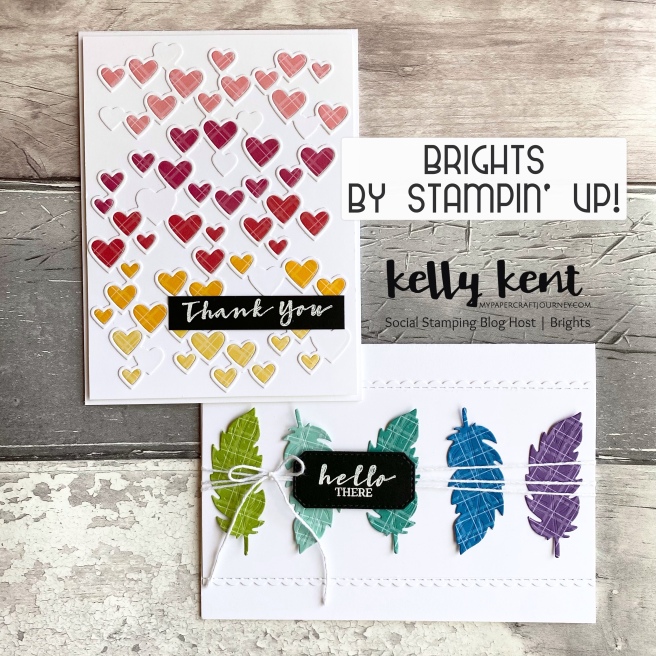
I made two cards for this hop so I could use all 10 colours in the Brights collection – Poppy Parade, Melon Mambo, Flirty Flamingo, Mango Melody, Daffodil Delight, Granny Apple Green, Coastal Cabana, Bermuda Bay, Pacific Point and Gorgeous Grape.
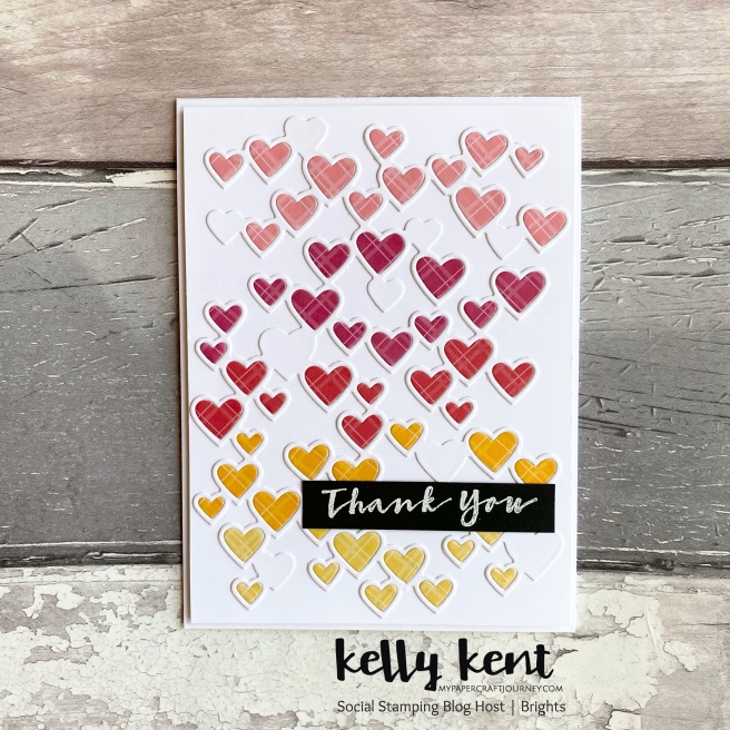
The first card uses Flirty Flamingo, Melon Mambo, Poppy Parade, Mango Melody and Daffodil Delight.
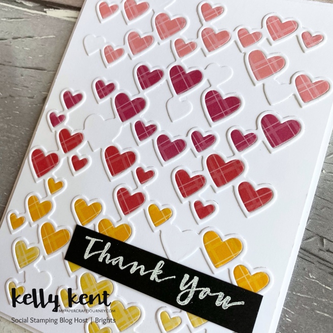
I cut the Detailed Hearts Die in Basic White cardstock and then again in the DSP so I could layer the hearts within the frame. So I didn’t waste any of the DSP, I cut 1.5″ strips of each colour and then cut out just the segments of hearts I needed.
I won’t lie, this card was time consuming – but it’s worth placing each of those little hearts into the space and filling it up with pretty colour.
The sentiment for both cards is from the Sweet Strawberry stamp set – white heat embossed on black cardstock as I love the contrast of black, white and the pop of colour from the Brights.
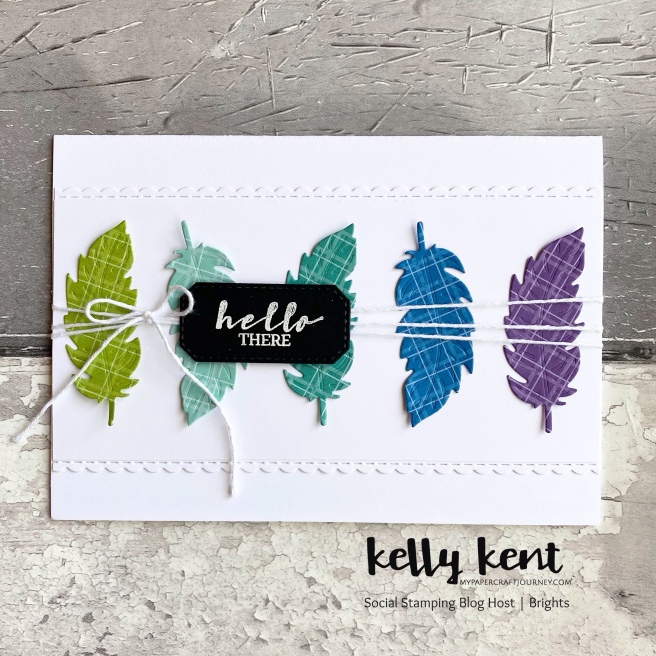
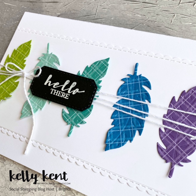
The second card has been swirling around my mind for a while – I’ve had feathers on the brain! And the combination of Granny Apple Green, Coastal Cabana, Bermuda Bay, Pacific Point and Gorgeous Grape seemed like the perfect colour combination to make it come to life.
The feather die is from the Nature’s Thoughts Dies. The pretty scallop edge is from the Be Mine Stitched Dies. And the die I’ve used for the hello there sentiment is from the Hippo & Friends Dies.
Next up on the blog hop for some more bright creations is my gorgeous team member Lisa Whitehead. Lisa took advantage of a joining special with Stampin’ Up! a couple of years ago and has just celebrated her 2 year Stampinversary.
If you’d like to get your hands of 5 packs (200 sheets!) of DSP just for buying a Stampin’ Up! Starter Kit, then now is the time. This DSP will be available in the upcoming catalogue released in May 2021, so you’ll be among the first to have it in your stash. Click here to start adding items to the Starter Kit.
Thanks for hopping with us today. We look forward to sharing another colour collection again next month.



OOOH these cards are totally gorgeous. I love the hearts one – but I do know myself well enough that I would never have to patience to put all those little hearts into the spaces!!! So my favourite card is the feathers – love the crispness and the way each feather is flipped the other way – if you know what I mean? wonderful wonderful
I love both these creations Kelly! I can see the work that would have gone into the hearts one but the effort was worth it. Thanks for letting me join in the blog hop late. Mandy x
Two stunners-duly note the patience required for the heart card-looks satisfying though! Two years of being part of a fab team and loving every minute!
Two stunning cards. I love how you’ve used all 10 colours across the two cards. The hearts one was so worth the effort. I love how you used the DSP on both cards. I love the crispness of the white cards with the pops of colour.
Both gorgeous Kelly, I’ve done those heart cards and they are pretty special but time consuming so I take my hat off to you, but I absolutely love the feathers, so captivating, I would love to CASE this. You are inspirational as always.
I’m very impressed that you were able to use all 10 Brights. Both cards are fab but I think I love the first a tad more – so much work that was well worth it. x