A Woody Happy Birthday!

Grandad Papercraft is celebrating his birthday today.

I’ve been saving this DSP from the Wood Textures stack for the right kind of card. I didn’t know what that special card was going to be til I started to put something together for Dad.Wood Textures | kelly kentMum & Dad moved into a new house last year.  The new house has a wood fire, so he’s been busy over the winter stocking up the wood piles (and then burning through them).

Wood Textures | kelly kent

These stacked logs were the perfect background for a masculine birthday card.

I’m a big fan of the ‘cluster’ card at the moment where you can add embellishments in groups to create layers & texture.

The leaves from the Seasonal Layers Thinlits seemed like a perfect fit for the wood DSP.

Wood Textures | kelly kent

Of my 2017 goals for card making was to pay more attention to the inside of cards.

For the first time ever (I think!), I’ve used DSP as a whole layer on the inside of the card.

Wood Textures | kelly kent

It feels strange to write on the DSP – but it look amazing!!!

Happy birthday to Grandad Papercraft.  We’ve enjoyed celebrating with you!

kelly kent | mypapercraftjourney.com


CASEing a Coffee Card

I hit up the catalogue this week for a card using the Coffee Cafe stamp set.

Do you ever use your catalogue for inspiration?

CASEing refers to “Copy And Share Everything” or “Copy And Selectively Edit”.

When I first joined Stampin’ Up!, the Annual Catalogues were marketed as ‘ideas books’.  And it’s such a good description.

The pages are filled with ideas for colour combinations, layouts, techniques & other ways you can use your Stampin’ Up! supplies.

This gorgeous photo shows so many ideas for the Coffee Break Suite…

Coffee Break Designer Series Paper

Cards inspired from the catalogue can either be a direct copy of what you see, a mix of elements or a starting point for your own creation.

Coffee Break | kelly kent

My finished card used the layout at the right of the catalogue photo, the DSP background from the card above it and added some copper heat embossing & woodgrain textured embossing (which I have realise as I write this, is not longer current!).

Coffee Break | kelly kent

If you already love using the catalogue for inspiration, or if it’s a new concept to you, you might want to join our CASEing the Catty Facebook page.

Each week we select a catalogue category or theme and set a challenge for you to ‘CASE’ the catalogue.

I find my best creations often come out of challenges!

Be inspired!

kelly kent | mypapercraftjourney.com


Product List

Stamp Review Crew – Coffee Cafe

Hello!  What does this lovely Monday hold for you?

It’s week one of the winter school holidays here, so we are having fun between showers, rugging up against the cold and spending some quality time inside!

Winter weather is always a great excuse to put on a movie and spend some time at the craft table as well – so there’s been some of that too!!!

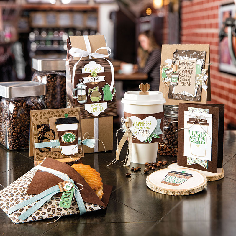
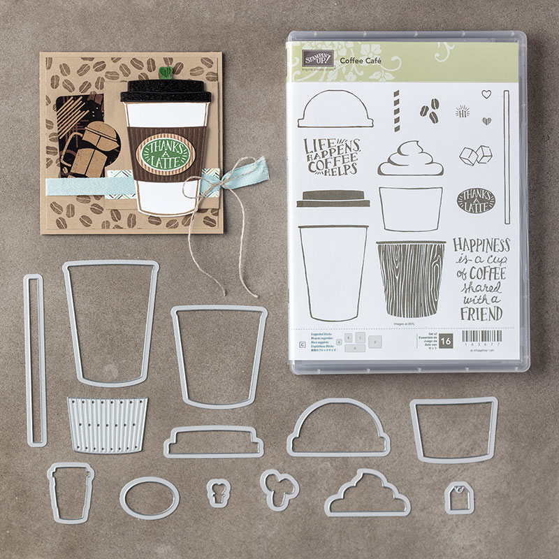
I’ve been busy over the last week putting together not one, but four cards for today’s Stamp Review Crew blog hop featuring the Coffee Cafe stamp set, together with the coordinating Coffee Cups Framelits dies and wonderful Coffee Break DSP.  This suite is great for all occasions!

Prepare to be dazzled as you zoom around the world on a coffee filled adventure with some surprises along the way!

The hop goes around in a circle, so you may have already visited the gorgeous Twila Davis in the US!  The link at the end of this post continues the hop for you – to Bronwyn Eastley, a lovely demonstrator in Tasmania who I love to be able to call a friend!


I initially had a difficult time brewing ideas for this hop (pun intended!) but once I got started, they just flowed!

I’ve kept with the suite colours & overall theme for these designs – I just love the DSP!!!

Stamp Review Crew - Coffee Cafe | kelly kent

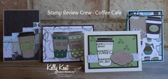
Here’s all the cards in more detail – warning, lots of photos to come!!!

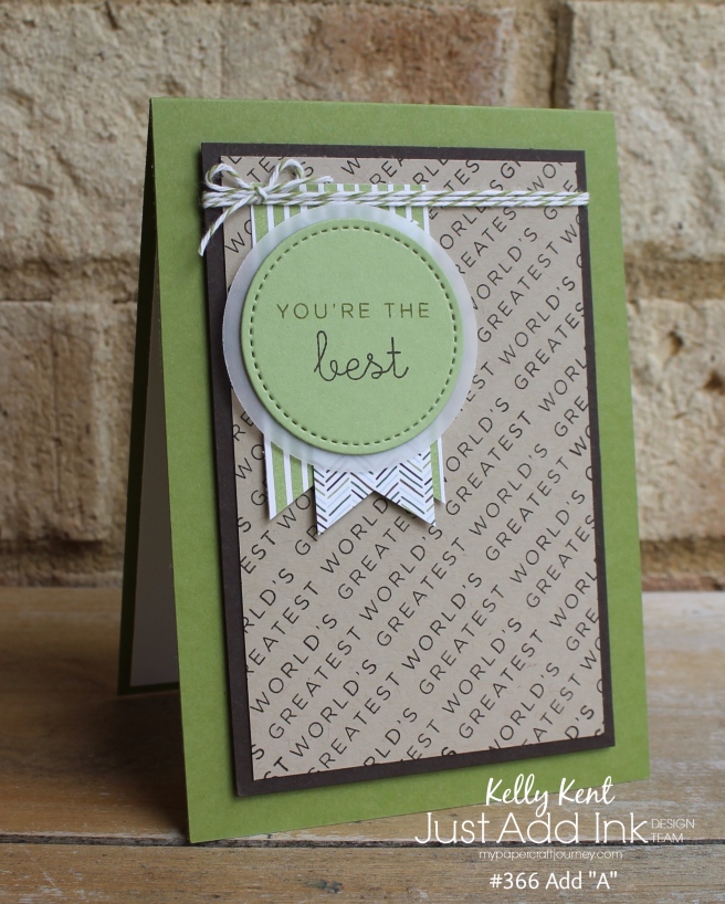
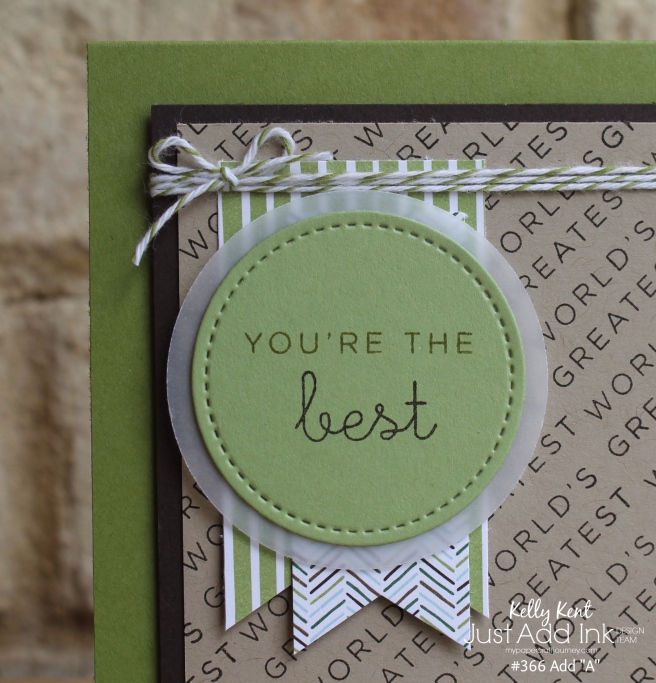
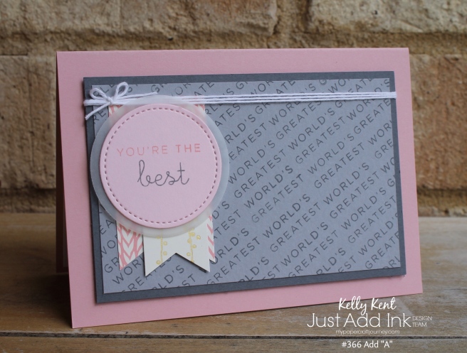
The first card is a lovely generic sentiment card that would be perfect for any number of occasions.

It really highlights how awesome the DSP is!

Stamp Review Crew - Coffee Cafe | kelly kent

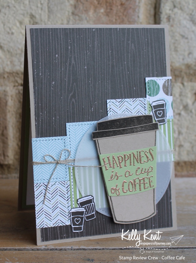
And features one of the great sentiments in the stamp set.

I love that it fits in the belly band – which makes it easy to add!

Stamp Review Crew - Coffee Cafe | kelly kent

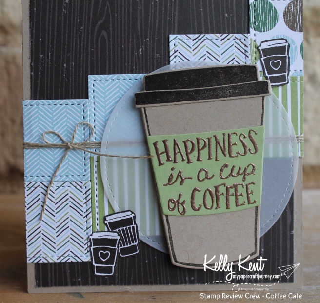
Did you spy those cute little cups on either side of the main coffee image?  They are fussy cut from the DSP – endless possibilities!


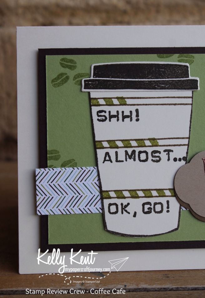
The next card has a hard-hitting statement… because you know if someone loves you  more than their coffee, it’s got to be a lot!

Stamp Review Crew - Coffee Cafe | kelly kent

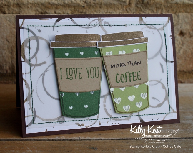
The “I Love You” is from the Happy Birthday Gorgeous stamp set – the font is a lovely compatible match for the “coffee” wording which I’ve stolen from the large sentiment in this stamp set.

Stamp Review Crew - Coffee Cafe | kelly kent

I tried a few different lettering options for the ‘more than’ text and in the end I decided that my handwriting emulated when the cafe writes your name on the takeaway cup.

During my collating ideas process, I tried to come up with a card that used the name writing on the coffee cup idea in a funny way – you know, like “Stephen with a ph”… I’m still working on it!


Card #3 is my favourite… I think!

I’ve seen this idea on coffee mugs and thought it went well with the ‘life happens’ sentiment.

Stamp Review Crew - Coffee Cafe | kelly kent

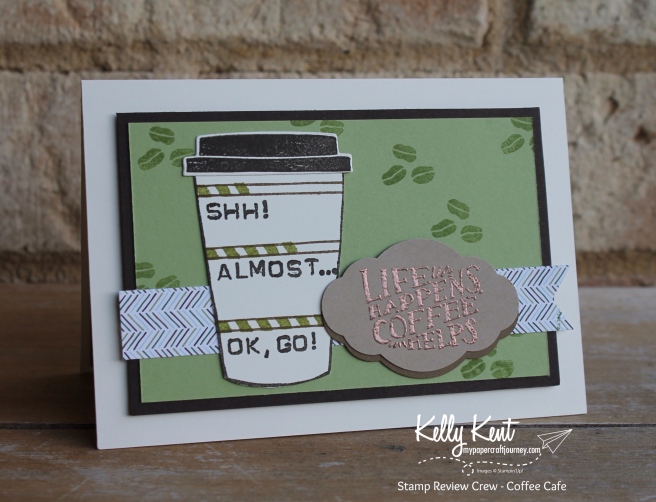
We all have that friend who {does not} function until they’ve had their first coffee of the day?!?!  Maybe you live with one?

Stamp Review Crew - Coffee Cafe | kelly kent


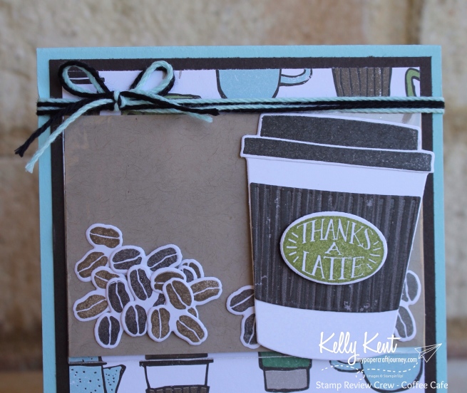
And the final card is a cello bag shaker card – because those little coffee beans are too cute!!!

Stamp Review Crew - Coffee Cafe | kelly kent

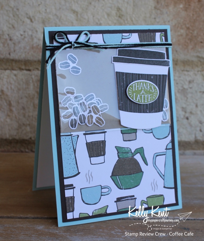
I love a good pun – so the ‘thanks a latte’ sentiment tickles my fancy!

Stamp Review Crew - Coffee Cafe | kelly kent


That completes my set of Coffee Cafe cards for today’s blog post.

For more inspiration, click the next button to visit the amazing Bronwyn Eastley in Tasmania – I know she has something wonderful to show you the possibilities this set holds!

If there’s any broken links, or you’d like to visit the main Stamp Review Crew blog – click here for a full participant list.

Thanks for joining us today!
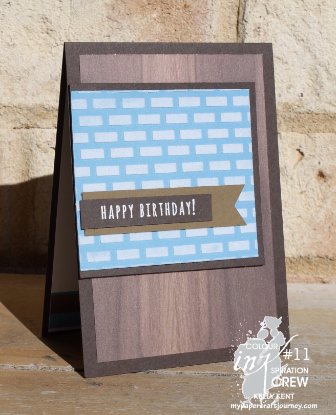
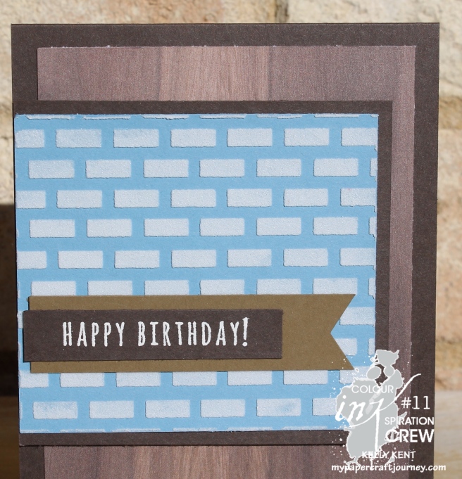
Just Add Ink #366 – Add “A”

Welcome to another week of Just Add Ink.  So many lovely entries – thanks so much to all the artists that join the challenges each week!

We’ve got another wonderful theme just week – add “A” as suggested by Tina.  “A” is a great letter – it offers so many options!

Image may contain: text

I have used “A” for {APPRECIATION}.

One of the stamp sets that caught my eye in the new catalogue was the ‘World’s Best Trophy’ set.  I loved the huge variety and number of personalised sentiments it offered – 53 stamps in all!!!

As it turns out, the generic sentiments make a great card of appreciation!

JAI #366 Add "A" for Appreciation | kelly kent

I used the ‘world’s greatest’ to stamp the background in a repetition pattern, offsetting the line spacing so that it reads across as well as down.

And then I used the ‘you’re the’ & ‘best’ stamps to create a focal point using banners to make it award or medal like in keeping with my theme!

JAI #366 Add "A" for Appreciation | kelly kent

And yes, using Coffee Break DSP again – I just love it!!!


Since the first card worked out so well I thought I’d make another in more girly colours.  I have so many women in my life that I am appreciative of – so this is for all of you!!!

JAI #366 Add "A" for Appreciation | kelly kent

More lovely DSP – this time using the Bundle of Love DSP.  Pink on one side, gold on the the other!!

As with many of my card designs, I made it ‘same-same-but-different by not only changing the colours, but flipping the layout into landscape mode.  It’s a great way to create a new card with little extra design time.

JAI #366 Add "A" for Appreciation | kelly kent

If you’d like to “Just Add A”, then please link your card to our challenge blog and add a photo to our link up.  Each week we select a winner and 2 honourable mentions.

We love seeing what you create and I’m constantly inspired by the talented crafters that join us for the Just Add Ink challenges.

You can also find the full gallery of design team cards on the Just Add Ink blog!

Until next week, be amazing, awesome & artistic!!!


Product List

Colour INKspiration #11

We’re 10 challenges down and I continue to be inspired & amazed by all the entries that you are contributing on our Facebook page each fortnight!

Are you ready for another???

Colour INKspiration #11 is blues & browns – and I can’t wait to see what you create!

Image may contain: coffee cup and drink

This one stumped me for a while – I don’t naturally use a lot of Marina Mist!

But, they don’t call it a challenge because it’s my favourites each week!

I was dazzled by the other cards the design team made – continue on the hop to see the amazing creations!!!

After quite a bit of paper pushing, this is what I came up with…

Colour INKspiration #11 | kelly kent

The longer it sat, the happier I was – just a clean & simple masculine card!

The Wood Textures DSP really helped me out on this one!  I love that DSP stack!


Did you spy the new embossing paste again?

I think I’m going to use this on every card for the next forever!!

Colour INKspiration #11 | kelly kent

Please join us with your card for this challenge.  All the action happens on our Facebook page – no blog required to participate with your gorgeous creation!

But if you have a blog, feel free to leave a link so that members of the group can visit you.

Next up on the crew’s blog hop is Jackie Noble over in New Zealand!  You’re going to love what she’s created!

Colour INKspiration #10

Another amazing fortnight of challenge entries!

If you’re not already on our challenge page over on Facebook, join us to for wonderful ideas shared every day by crafters just like you!

It’s our 10th challenge this week – which is a wonderful achievement for Bronwyn Eastley and the Colour INKspiration team.

If you’re already on your way hopping, did you love what Denita made?  I always admire her creativity.


The colours for Colour INKspiration #10 are amazing {again} and will stretch the way in which you look at your crafting projects.

Image may contain: 1 person, text

Cajun Craze, Island Indigo, Smoky Slate and Delightful Dijon!

This is the last time the crew will play with Delightful Dijon as it’s set to retire next week.

Have you bought all the items you *need* from the retirement list?  Next week it’ll be all about the new catalogue!


When I first sat down to play with these colours, I was raiding Nanna Papercraft’s craft room while she’s on holidays.

I’m not sure if you’ve noticed, but Delightful Dijon is an absolutely perfect colour for beer!

So, with the Mixed Drinks stamp set in my hand, this is what I created for Colour INKspiration #10….

Colour INKspiration #10 | kelly kent

Lots of Island Indigo & Smoky Slate – because I love them!

Whisper White to break all those strong colours up (don’t forget you can use any neutral or metallic in your Colour INKspiration project).

Delightful Dijon – because it makes fantastic beer!

And just a touch of Cajun Craze for the sentiment to finish the challenge!


I’m not sure if you’ve looked at the Mixed Drinks stamp set (it’s awesome!)…

There’s only one beer mug?  How did I get it to ‘clink’ I hear you ask?!?

Colour INKspiration #10 | kelly kent

I used the reflection technique to flip it over.

Stamp in Versamark & emboss the beer mug as normal.

Then, stamp it again on Window Sheet.  Turn the window sheet upside down and very carefully (it’s slippery and wants to slide away from you producing a truly spectacular beer googles effect!) press down on the stamped image.  This will transfer it to the cardstock -as a mirror image.  Emboss as usual and colour both images with an Aqua Painter and Delightful Dijon ink.


I’ve also put a special touch on the inside.

If you’re going to send a beer themed card, you should probably send beer money…

Colour INKspiration #10 | kelly kent

Personally, I’d rather stamping money… but I guess they don’t hold the same appeal for everyone!

Next up for some colourful inspiration is my gorgeous friend Lou Kitzelman

And join us on Facebook for the challenge.  It runs for three weeks, so plenty of time to get inky!


Product List

Heat Tool

$50.00

Colour INKspiration #08

Everyone loved the soft & pretty colours of last fortnight’s Colour INKspiration challenge #07.

I lost count of how many ‘lovely’ adjectives I used on commenting on all the beautiful projects!!!

This fortnight’s challenge is going to be polarising!  It’s deeper & darker and more moody!

And features Delightful Dijon which is rarely a favourite colour on anyone’s list!  But I admit that it has grown on me as it nears retirement!!!

I think it’s perfect for cards with a nature theme, masculine/neutral cards or baby cards.

I almost went down the baby card line, but on reflection, I’ve used that theme a number of time for challenges recently.

So, I decided on a neutral / masculine thank you card.  You could easily change the sentiment on this card and make it a birthday card instead.

Since this challenge features 2 of the retiring 2015-2017 In Colors – Delightful Dijon & Tip Top Taupe – I decided on a retiring stamp set too.

It’s a great time of the year to have one last play with sets that won’t make the 2017-2018 Annual Catalogue like the Work of Art stamp set.

UPDATE: It seems like I forgot to check if this set was actually retiring.  It’s not!!! Whoopsie!  Thanks to one of the DT crew for checking for me!

Pleased to be able to share it with you for another year to come!

This card is quite simple, with a fun repetitive pattern using the circle stamp from Work of Art.

Effective techniques don’t always have to be hard work!

This card uses second generation or stamping off to achieve a lighter variation of the same colour.  It’s perfect for darker colours to get some light & shade.

I’ve stamped in Delightful Dijon, Tip Top Taupe and Soft Suede in full strength for some spots, then with technique to achieve a softer tone for each colour for other spots.

You stamp as normal, then stamp again without reinking – getting a lighter colour (second generation).  Or if you just need the lighter version, stamp onto scrap/scratch paper first then onto your project without reinking.

I’ve used it again on the inside of the card…

I’ve added a ‘you’re the best’ sentiment from the All Things Thanks stamp set in white heat embossing on Early Espresso cardstock.  I love the light on dark effect of heat embossing in white.

I was excited to see that All Things Thanks is carrying over!!!

And although you can’t tell in the photo, the case base is made using the new Very Vanilla {THICK} cardstock!  So excited we’re going to have this style of cardstock in VV as well as Whisper White!


You’re going to want to keep going on this hop to see all the amazing ways you can use Delightful Dijon & those moody neutrals.

Next up is the talented & lovely Jackie Noble.

Thanks for visiting!

If you’re inspired to enter our challenge, please visit our Facebook page to join the fun!


Products on the Retirement List


Products you’ll find in the 2017-2018 Annual Catalogue

Heat Tool

$50.00

Urban Underground Tools

I love the inspiration that challenges offer.

This week it was the sketch from Create with Connie & Mary that caught my attention when I was designing cards for my Tuesday class.

I love the idea of the three panels!

We used the Nailed It stamp set to create one panel, which once we’d finished stamping, we cut into 3 equal panels.

I love the Urban Underground suite.  Yellow, white & gray is one of my favourite colour trios!!!

And those little embellishments are unreal!

You should try out this sketch, it’s a great starting point for any card!


Product List

You Can’t Go Wrong With A Shaker Card!

It’s my firm belief, when in doubt about making a card for someone, that you can’t go wrong with moving pieces.

People love interactive cards and they’ll be so busy shaking, sliding or making it move that they won’t be worried about much else.

So, when making a card for Miss Papercraft’s bestie, who turns 6 tomorrow, it was a simple shaker card on order.

There wasn’t a party theme to follow, so I went with the classic black, red & white combination!

Boys Birthday Shaker Card. Kelly Kent - mypapercraftjourney.com.

I started the card thinking I’d add a superhero (hence the pow feature bubble) but decided against it at the end.  Simple works!

Shaker cards are a nuisance to photograph – with all the reflection, so please accept this as my best attempt!!!

His birthday present is an outing, so the ‘here’s to another year of full of adventures’ was perfect for the middle.

Boys Birthday Shaker Card. Kelly Kent - mypapercraftjourney.com.

I love watching the evolution of my children’s writing & literacy skills!!!

It’s such a cute age!

Product List

Real Red Stampin' Write Marker

Real Red Stampin’ Write Marker
[100052]
$6.00

Just Add Ink #343 Pop Up & Interactive

Just Add Ink Design Team

The Just Add Ink Design Team are starting 2017 with a blog hop!

And it’s all about pop up & interactive cards.  You’re going to love the ideas shared in this hop.

jai343


I’ve chosen a style of pop up card that has been doing the rounds lately called a Twist & Pop card or a Pop Up Panel card.

From the front it looks like a normal card but as you open it the middle jumps out to reveal a pop up centre panel.  So cool.

And like many ‘fancy’ cards, once you know how, they are super easy to make!

I used the tutorial by Jan B and changed up the design to make it a Pokeball card for a friend of the Miss Papercrafts who loves Pokemon!

I always find photographing fancy fold cards a challenge, so I made a video to show you how cool this style of card is!


Pop up cards are always better in 3D!

But here’s the photos anyway….

Just Add Ink #343 Twist & Pop Pokemon Card. Kelly Kent - mypapercraftjourney.com.

Just Add Ink #343 Twist & Pop Pokemon Card. Kelly Kent - mypapercraftjourney.com.

Just Add Ink #343 Twist & Pop Pokemon Card. Kelly Kent - mypapercraftjourney.com.

Just Add Ink #343 Twist & Pop Pokemon Card. Kelly Kent - mypapercraftjourney.com.

The Pokeball on the front is made from circle framelits.

The font on the inside is Cameo cut.  You can download the font here.


You should definitely try this style of card if you haven’t already – it’s a winner!

You’ll also want to keep hopping for more pop up & interactive card ideas.

Next up on the Just Add Ink hop is Karren over in New Zealand!

jai343_next

Please share your creations with us using the linky tool on the Just Add Ink blog.  You can try one of the awesome cards shared on this hop, or share another style of pop up / interactive card.  I’m always on the lookout for fabulous (but easy) design ideas!

Kelly Kent - mypapercraftjourney.com